Microsoft rebranded and launched the Accompli’s highly-praised app on January 29, 2015. This new application is called Outlook for Android. If you use Microsoft Exchange Server, you should give it a close look.
For those in my audience not already rolling their eyes, I am a new user of Android and am still getting the hang of it. I suffered the frequent humiliations of a lame map app for several months before realizing I could dump it for Google Maps and actually get reliable directions.
Yep, that’s me.
Installation and Setup
Fourth day on my new job and my boss, a mail client and IT guru, tells me to download and setup Outlook for Android. After he finished rolling his eyes as I loaded a micro SD card into my bottom-of-the-line Android phone (without which, I didn’t have enough memory for the app). App download, install, and setup was brief and simple.
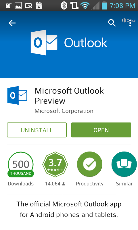
Outlook Installation Screen
Launching Outlook for Android
In the last two decades I have dealt with many UI’s–from the earliest Macs to Windows and even a few others thrown in. Some have been like stroll in the park, and some have been like clawing my way up Everest. Among these experiences, Outlook for Android is sublime.
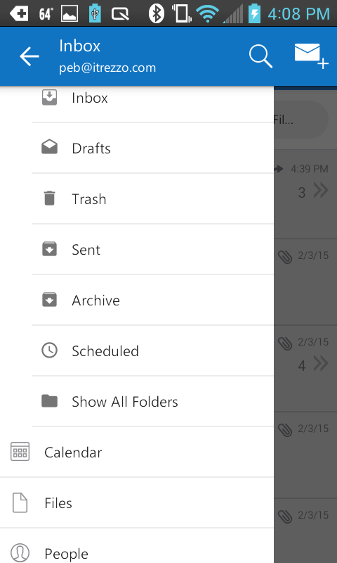
Outlook Home screen
Select them menu icon from the home screen and as shown above, it is clean access to email, calendar and attachments.
Navigating the Inbox
Selecting Inbox, Outlook presents emails according to which are likely to be the most important and urgent, with a color and code in front to make them easy to identify.
To my surprise, attachments were easy to open, read, and save to a cloud drive.
Further, the entries are actually conversations indicated with a number and arrows such that tapping on any produces the recent email string, again with codes.
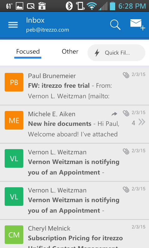
Outlook Inbox screen
Cool managings: swipe to the left moves the email to the trash (on the device and server). A swipe to the right schedules the email for later reading or filing in a folder.
Opening any email allows simple reply, reply all, forward, or delete.
A tap on the envelope logo leads to a “new email” screen.
Sending an Email
The Compose screen is as clean and fast as a Japanese bullet train.
Left hand attachment icon allows the sender to attach a file, an image, or to shoot and attach.
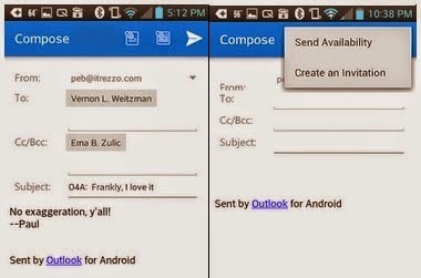
Outlook Compose screen with integrated Calendar
The Compose screen is as clean and fast as a Japanese bullet train.
Left hand attachment icon allows the sender to attach a file, an image, or to shoot and attach.
The middle icon sends availability for a meeting or creates and invitation for one.
The paper airplane does what they all do: it flies!
Managing Contacts
The contacts screen (called People) is integrated into the application. It is intelligent and offers contacts from in the order of most recent use.
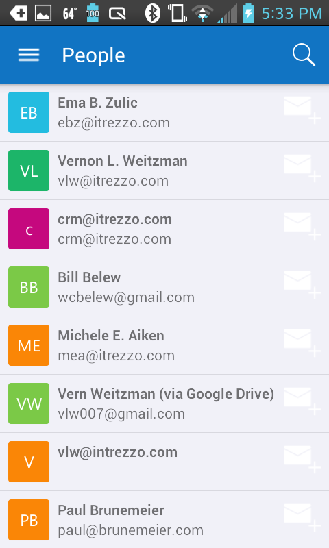
Outlook Contacts Screen
A find function allows the user to call up anyone based on a few letters from their first or last name or company.
The envelope icon to the right allows an email to be sent to that person using the application’s compose screen.
Scheduling Appointments
The Calendar screen is similarly clean and thoughtfully designed.
Get to any date and hour with the swipe of a finger–no annoying drop-downs or spinning wheels.
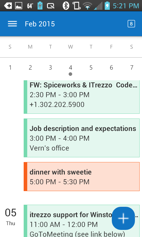
Outlook Calendar screen
If the app detects repeated swipes, a calendar page pops to select a date. The page can be raised or lowered with a vertical swipe. Days can be advanced or rolled back with horizontal swipes.
Clicking on the big plus sign brings up a screen to schedule an appointment.
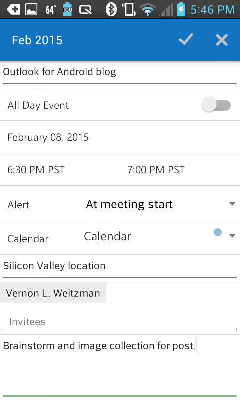
Outlook New Calendar Event
The new appointment screen is as clean and intuitive as the other parts of the app.
Without drop-downs, spinning dates or time wheels, The app allows the user to schedule a meeting, to specify location, and to invite as many attendees as he or she wishes.
User Rating; 5 Sighs of Satisfaction
These are the observations of a new user who has spent only a few hours with the app. Outlook for Android is simple to learn and use but has integrated functionality that works in cooperation with mail and cloud storage.
With so many variations of the Android mail app, you might consider standardizing on this free and compelling mail client.
Thanks, Microsoft + Accompli!
